Understanding the structure of a Swift project is a complex task. SwiftAlyzer is your solution! This page walks you through different functions helping you to analyze your code base.
Analyzing a Project

SwiftAlyzer allows you to analyze a Swift project and inspect the structure and dependencies in detail. Get started by selecting a project. SwiftAlyzer can analyze both single Xcode Project files and Workspaces.
You can also choose a target to analyze. By default a target with the same name as the analyzed project is preselected. You can switch to a different target by clicking Options in the lower left corner and using the dropdown button.
Each analysis can be saved as a document. This allows you to save your current state and continue later. Also you can easily share your analysis with your coworkers.
Getting familiar with SwiftAlyzer

SwiftAlyzer consists of four main panels. The Dependency Graph is located right in the center. Here you can find the components of your project and connections between them. You can find all features of the graph in the section Exploring the Dependency Graph.

On the left of the graph is the Navigation Panel. Here you can find a different representation of the project hierarchy. Also Tags and Frameworks are located here, allowing you to manipulate the content of the dependency graph. Finally, each action you perform is stored in the history, which allows you to undo and redo changes. Each tab is described in more detail in the section Using the Navigation Panel below.

Right to the graph is the Information Panel. It shows more information for selected nodes like outgoing and incoming edges and metrics. To get a list of all data displayed in this panel, take a look at the section Understanding the Information Panel

On top of these three panels is the Project Header. It displays the name and path to the selected project. Two buttons on the right allow you to close the Navigation and the Information Panel giving more space to the Dependency Graph. The last button re-analyzes the project to update the data of your analysis.
Exploring the Dependency Graph
The Dependency Graph is the heart and soul of SwiftAlyzer. Some nodes represent hierarchy layers like modules, groups and source files. Others represent code entities like classes, structs, enums and protocols. These nodes are connected by directed edges representing dependencies between nodes.
Navigating the Hierarchy
As mentioned above, the graph shows the hierarchy structure of the project. Nodes representing modules, groups and source files can be opened to show the nodes they contain by double clicking them. Another double click will close these hierarchy nodes and hide their sub nodes.
Imaging following project setup:
A single file Example.swift is placed in a group called App. In this file the class MainClass is declared. When analyzing this project, there would be a top level node representing the group App. By double clicking this node, it would open and show the node representing the source file Example.swift. Again, by double clicking it, the inner node MainClass becomes visible.
Selecting and Moving Nodes
You can select a node by clicking it. This will also highlight this node in the navigation panel and show additional information in the information panel.
Select multiple nodes either with cmd click or by using selecting all nodes in an area. Click and hold on an empty space in the graph and drag the mouse, so that nodes are completely covered by the overlay.
You can move all selected nodes by dragging these nodes to a new place. This will also update their parent nodes.
Zooming and Using the Mini-Map
You can zoom out of the graph to get a better overview or zoom in to take a detail look at an interesting part of the graph. Use your trackpad or the shortcuts cmd + and cmd – to do so.
The mini-map in the lower right corner of this panel helps you navigating the graph. Your position is highlighted with a read border, which is updated when you scroll or zoom. This way, you always know where you currently are in the graph.
Changing the Edge Draw Style
Seeing all edges may be overwhelming. You can reduce the number of visible edges by changing the edge draw style in the lower left corner of the graph. There are four different styles to choose from:
- All: All edges are visible. This is the default style.
- Connecting: Only those edges are visible that start and end in a selected node
- Incoming: Only those edges are visible that end in a selected node
- Outgoing: Only those edges are visible that start in a selected node
Using the Context Menu for Selected Nodes
Perform a right-click on the selected nodes to open a context menu. This context menu provides the options to add the selected nodes to a tag or a framework. To get more information about working with Tags and Frameworks see the next corresponding chapters.
Exporting the Graph as an Image
Moving nodes and filtering out unimportant information by using Tags and Frameworks can give you a good picture of your project. You can export the graph as an image by clicking on the menu entry Export graph as image or use the shortcut cmd-e.
Using the Navigation Panel
The Navigation Panel contains different sections to inspect and alter the structure of your project. Each section can be found under one of the four tabs.
Inspecting the Project Structure
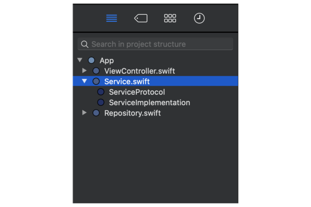
The first tab shows the structure of the analyzed project. Modules, groups and source files can be expanded to show the hierarchy they contain. The lowest level of the project structure are code entities that can’t be expanded any more.
The colored indicator left to a hierarchy name indicates the depth of an item. The top level item has the lightest color, deeper items have darker colors.
Clicking on one item highlights it not only in the Navigation Panel, but also the corresponding node in the Dependency Graph. The Information Panel shows more data about the selected item.
Working with Tags

Next comes the tags tab. Tags provide a way to categories nodes. You can create new tags, add elements to them and hide or show all elements belonging to a tag.
Nodes can be referenced by their name or by Regex, e.g. if you want to add all protocols to a tag, simply add .*protocol to a tag.
Creating categories is a powerful tool to hide unimportant nodes from the graph allowing you to focus on important ones. You can hide all nodes belonging to a tag by clicking the eye icon next to it. By clicking on the icon again, the hidden nodes will become visible again.
Some tags are associated with frameworks, which are covered in the next section. These tags can’t be deleted and have the framework icon next to them, which can be seen in the last row for the tag UIKit.
Editing Frameworks
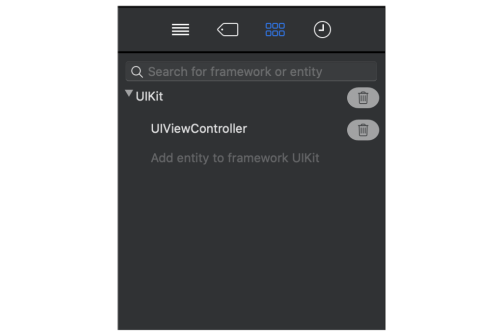
The third tab provides information about frameworks. Frameworks are similar to tags in that they group entities under a common name. But they differ in their origin. While you create tags to use categories, frameworks are a result of the analysis.
For example all entities from UIKit found in your project are grouped under this framework. When analyzing a workspace containing a CocoaPods project, this project is analyzed as well. This gives you information about the used pods and the code entities they contain. These information is used to create frameworks, which are initially hidden. Each framework corresponds to a tag, which you can use to show or hide the dependencies between your project and a framework.
These frameworks are not final and can be edited. Just like tags, frameworks can manually be added, renamed and deleted. Also you can edit the list of entities that belong to a framework.
Browsing the History
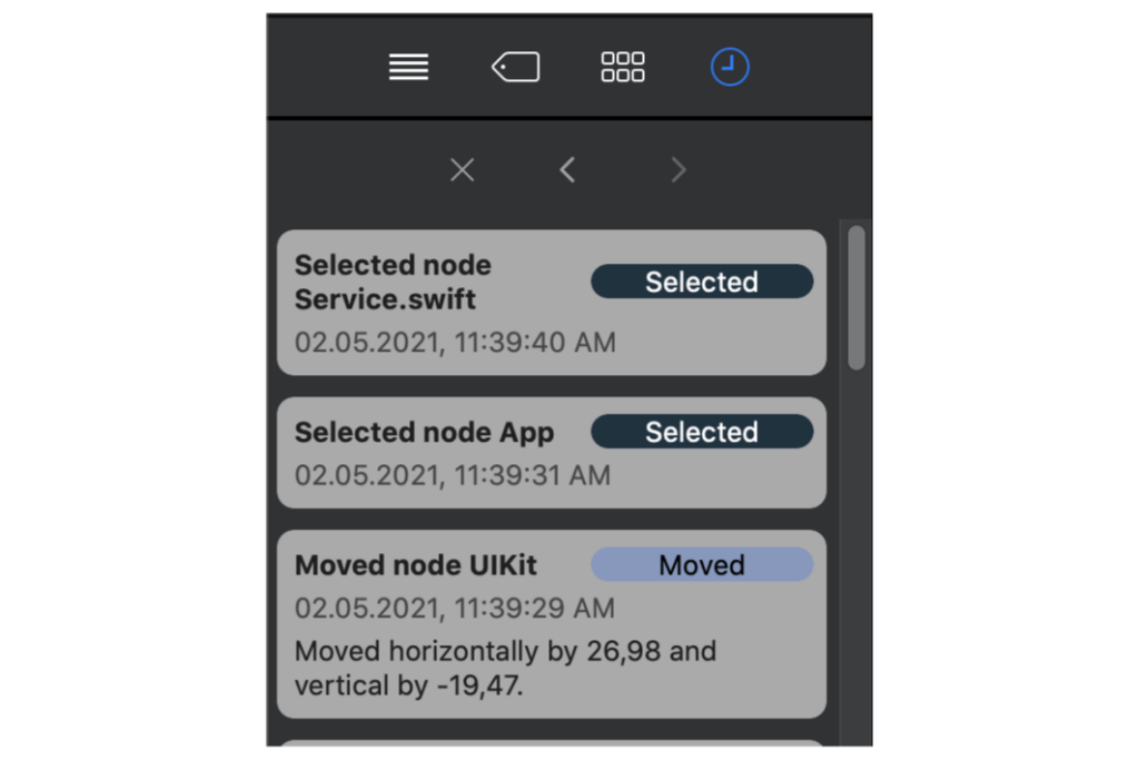
Each action is recorded and displayed in the history. Whether you moved a node, added a framework entity or used a tag, it’s listed in the last tab of the Navigation Panel.
This shows the path you took while inspecting the analysis and digging deeper into the details of your project.
Each action can be undone and redone, so that you can step through your steps. You can do this by using the buttons in this tab or by using cmd-z and shift-cmd-z wherever you are in the project.
Understanding the Information Panel
The final section of SwiftAlyzer is the Information Panel on the right. It provides detailed information and metrics about the currently selected nodes.
Starting with the Information Header

At the top you can find the name of the selected node together with its type. If there are multiple nodes selected, all types are shown.
A spinner shows that metrics are still calculated in the background and not up-to-date yet. Collecting and calculating all metrics is a time consuming process. Thus you can find available metrics as fast as possible, while more are still calculated. Once this process is finished, the indicator is removed.
Seeing the Tags of selected Nodes
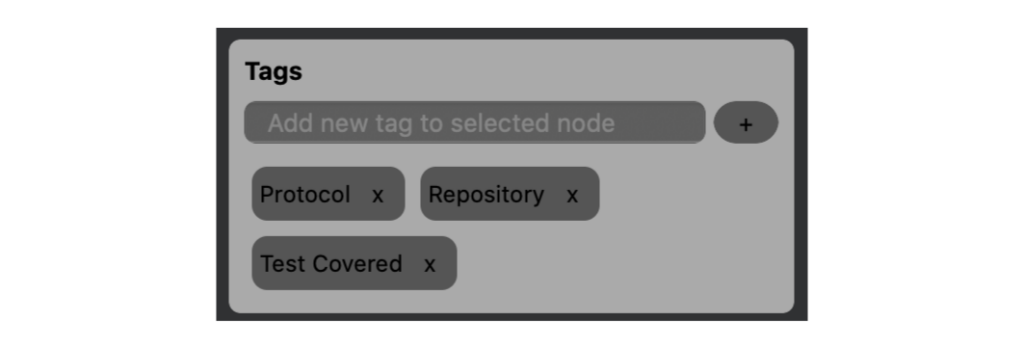
Next, you can find a section to change the tags of the selected node. This provides a different view on tags than the tags tab in the Navigation Panel. The Navigation Panel shows a list of tags together with the elements corresponding to the tags. The Information Panel presents all tags where this node is a part of. You can add tags to and remove tags from all selected nodes at once.
Getting Information about Child Nodes
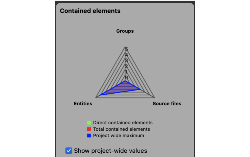
Following the tags comes a section about the content of hierarchy nodes like modules, groups and source files.
This part of the information panel starts with a chart visualizing the number of different nodes contained inside of the currently selected hierarchy node.
In addition to the selected node, project-wide values are shown as well. You can hide these by using the checkbox below the chart.
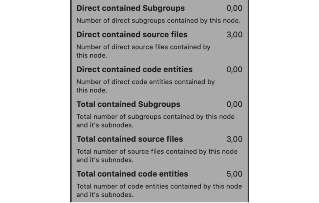
The same information is presented as a list below this graph. While the chart gives you a good indication at first glance, this list provides detailed information.
Both the direct contained entities and the total contained entities are listed. While the former are direct children of the selected hierarchy node, the later count all nodes that are part of the hierarchy with the selected node as the root.

This section ends with the total maximum values for the whole analyzed project.
Exploring in- and outgoing edges

Although edges in the Dependency Graph are a good way to see dependencies in your code base, they can’t show multiple connections between the same two nodes. To get this data, you can look at the next section in the Information Panel.
It presents the total number of incoming and outgoing edges of the selected node and lists all edges.
In the example on the right side, the node Service.swift is selected, which has one incoming edge and one outgoing edge. The corresponding information shows from which nodes these edges are coming from or going to.
Understanding your Project with Metrics
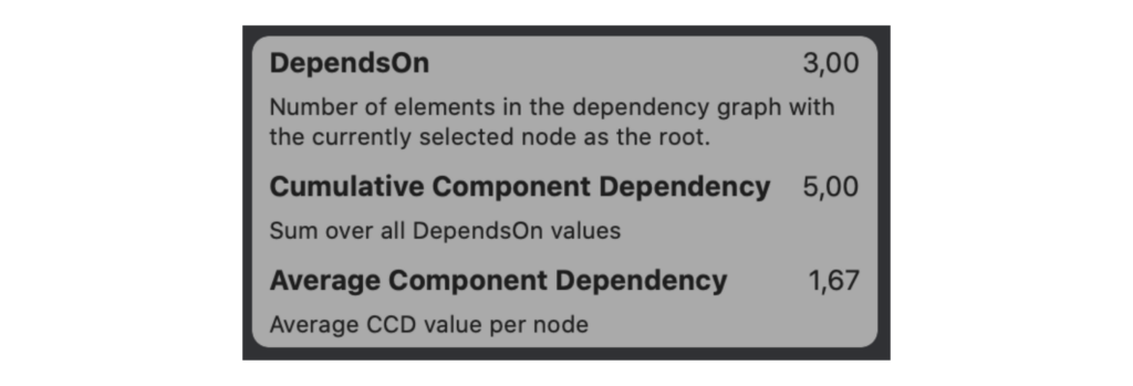
Finally, the last section in the Information Panel shows the metric Cumulative Component Dependency together with the two related metrics Average Component Dependency and DependsOn.
They indicate whether a system is testable and by comparing them over time they can show the introduction of cyclic dependencies.
You can finde more information about this metric in our blog post Understanding your Project with metrics: CCD.